This graph shows that temperatures have gone up over the last twenty years. But its an up-and-down ride. The highest temperatures occurred in the late nineties. So when global warming skeptics claim temperatures have cooled over the last ten years, they are comparing today to the highest temperatures ever recorded. Now lets look at the last 100 years:

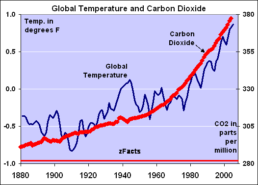
Here you can see how much temperatures have risen. Looking at the temperature declines of the last ten years in this context, its obvious that this is just a small blip in the trend. Warming skeptics are pulling the wool over people's eyes when they say "its getting cooler!" Now, whether the warming is man-made or due to sun spots or whatever, that may be a leg for the skeptics to stand on. What I do know is that fossil fuels are limited, and that alone is a good reason to push for renewable energy. Here's a graph of the last 2000 years:

And "correlation does not mean causation" as they say, but this graph is always eye-opening:

No comments:
Post a Comment